Overview __________________
Objective: Create a health application that helps people during the pandemic.
My Role: Sole UX designer - User Research, UX/UI Design, Prototyping, Usability Testing
Impact: An end-to-end design and conceptual application that would act as a patient repository of notes of symptoms that helps them communicate important information to their provider.
Project Information: End-to-end design, Mobile application (iOS)
Duration: September 2020 - July 2021
Tools Used: Google Survey, Miro, OptimalSort, Whimsical, Balsamiq, Adobe XD
Problem
Sometimes as a patient, you can feel like visiting the doctor wasn’t as productive or felt like the doctor couldn't really help. Often, you're asked many questions but might not have a detailed record to provide.
I wanted to think about an easy and effective way to keep track of information that could help people help their doctors.
Solution
A mobile health journal could provide a simple way to regularly record any health-related symptom, behavior, or biometrics. As an added value, users could receive a health score based on the measurable data recorded by health devices.
This scoring system could help people better understand their own personal health and can empower them as very valuable contributors to their diagnosis and treatment plans.
Design Thinking / Project Timeline
Constraints
1. Access to participants that fit the screening criteria set for the user research
2. Limited expert-level knowledge about how to best record information for health conditions
3. Pivoting solution after getting stakeholder feedback
Empathize _________________
“How might we...design a tool that helps people become knowledgeable about their health?”
Methods Used
‣ Competitive analysis
‣ Survey
‣ User interviews
Competitive Analysis
I researched and compared two popular health monitoring apps, Bearable and CareClinic, to understand how other designers created similar solutions.
Key Insights:
‣ Health monitoring apps vary with data entry complexity
‣ Lack of customizability for measurement scales
‣ Narrow information database, users want more options so they can track accurately (i.e. food, medication names, etc.)
‣ There are not many apps that provide the ability to integrate health tracking services and fewer that also show health scores
Survey
I needed more information about people who could be potential users, in order to best design for their needs and circumstances. I also used the survey to seek potential interview participants. A total of 22 people filled out the survey, while only 6 actually used a health monitoring app.
Research Goals:
1. Find out what patients' health experiences are like
2. Discover pain points with health monitoring apps
3. Determine patient goals with using a health monitoring app
4. Discover the contexts (environmental, situational, etc.) that patients utilize health monitoring apps
Key Insights:
All Participants:
‣ 70% felt not very to slightly knowledgeable about their health when asked by a doctor about their health concerns
The 6 health monitoring app users:
‣ 30% Have used an app to monitor their health
‣ 30% Used the app very frequently
‣ 2 out 6 people used the app every day
‣ The majority of people were most interested in symptom and medication tracking features
User Interviews
I needed to hear directly from people who health monitored using apps, what their thoughts and feelings were so I could better step in their shoes when thinking of the problem. With this information, I can ensure that my designs are not biased and are based on actual issues users face.
Research goals:
1. Discover what health and wellbeing goals people have
2. Find out point points of current health monitoring apps/methods
3. Determine goals of using a health monitoring app
4. Discover the contexts of use
Affinity Mapping & Synthesis:
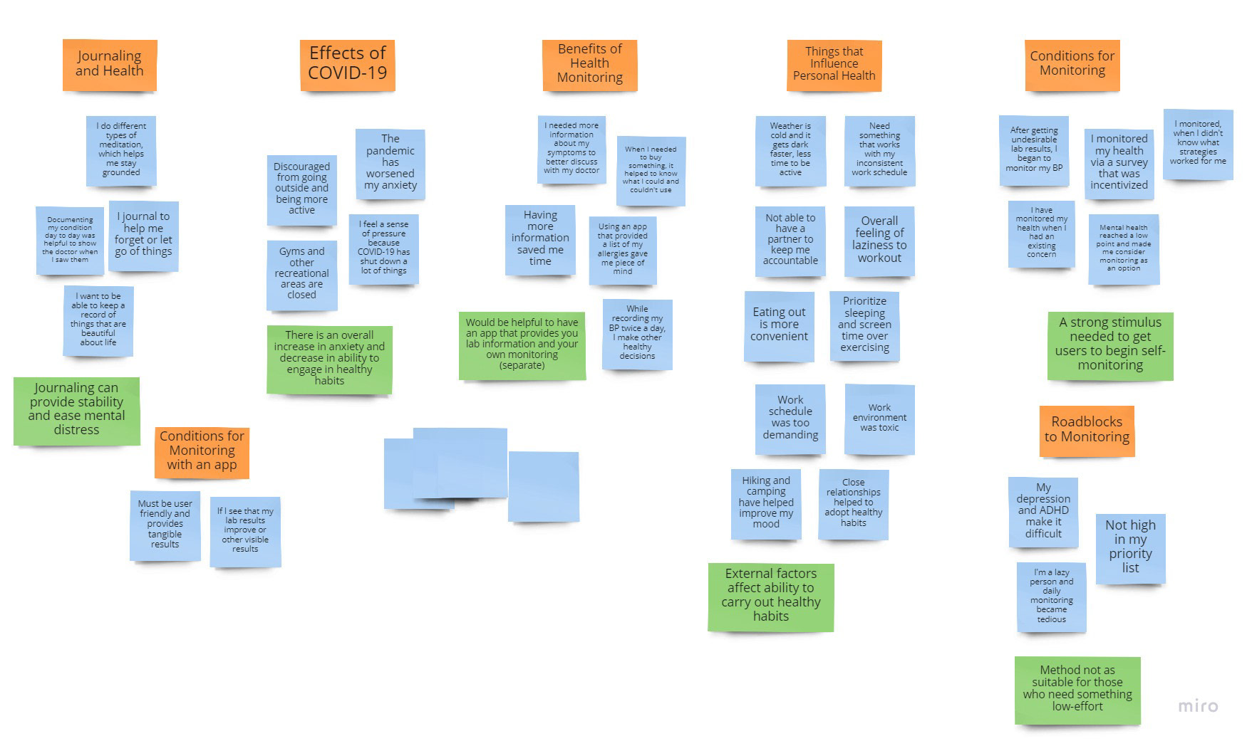
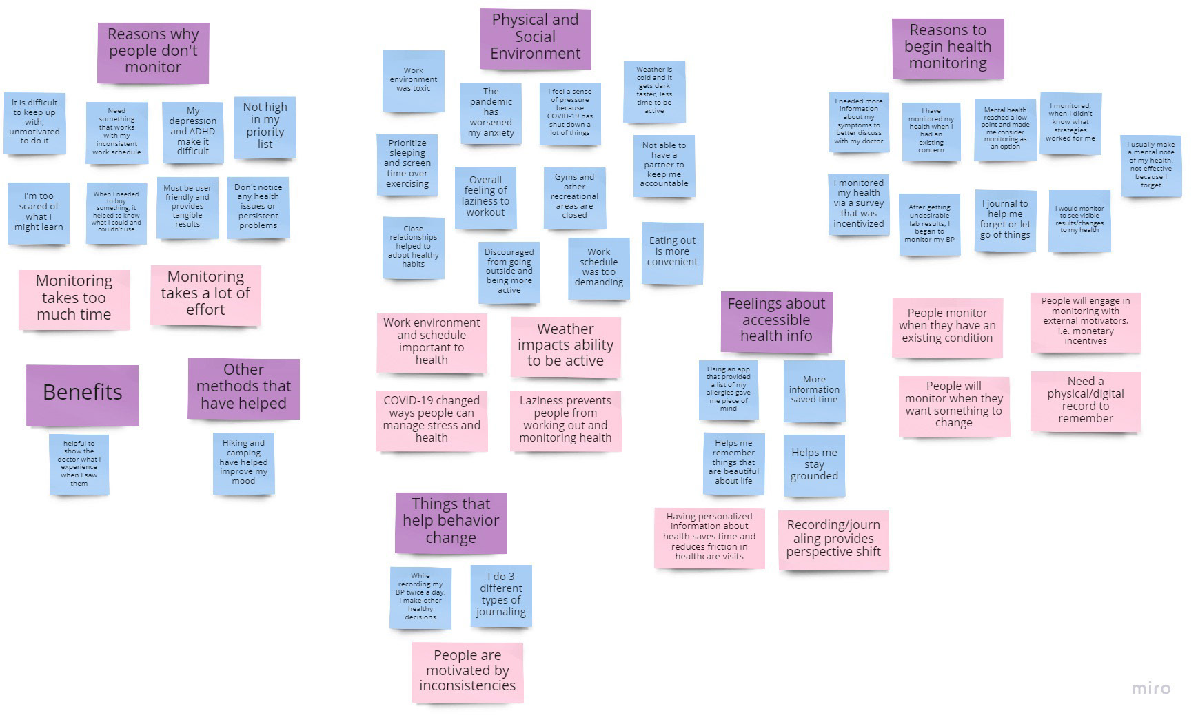
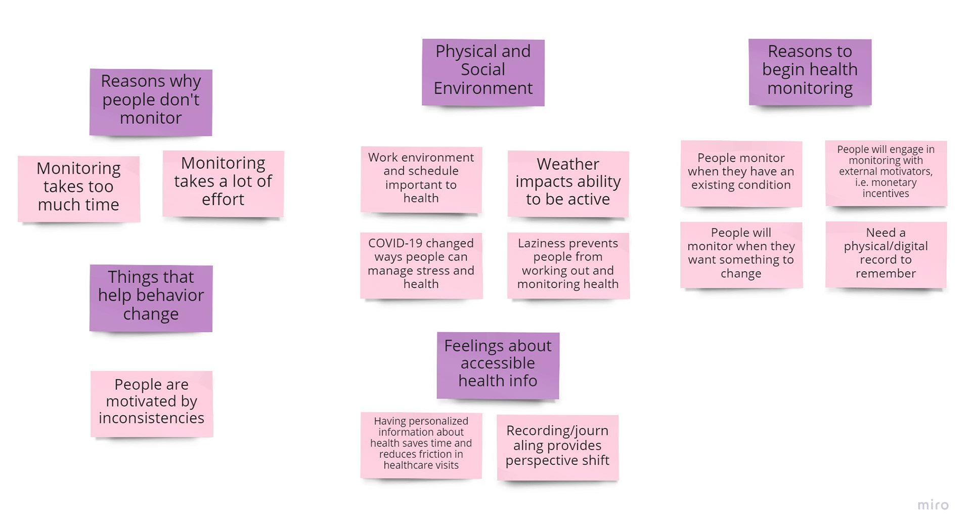
Key Findings:
Barriers to Self-Monitoring
‣ Recording detailed information can take a lot of time and effort
Environmental Factors
‣ Community and environment influence the adoption of positive health behaviors
Motivating Factors
‣ External incentives could provide reason for users to record (i.e. health insurance cost reductions)
‣ Monitoring helps keep track of progress, which increases motivation to change behaviors
‣ People like knowing what happens in their body
"More information is always better."
"I think that because we are so used to receiving data about almost everything, it can make us feel powerful..."
Define _____________________
User Personas
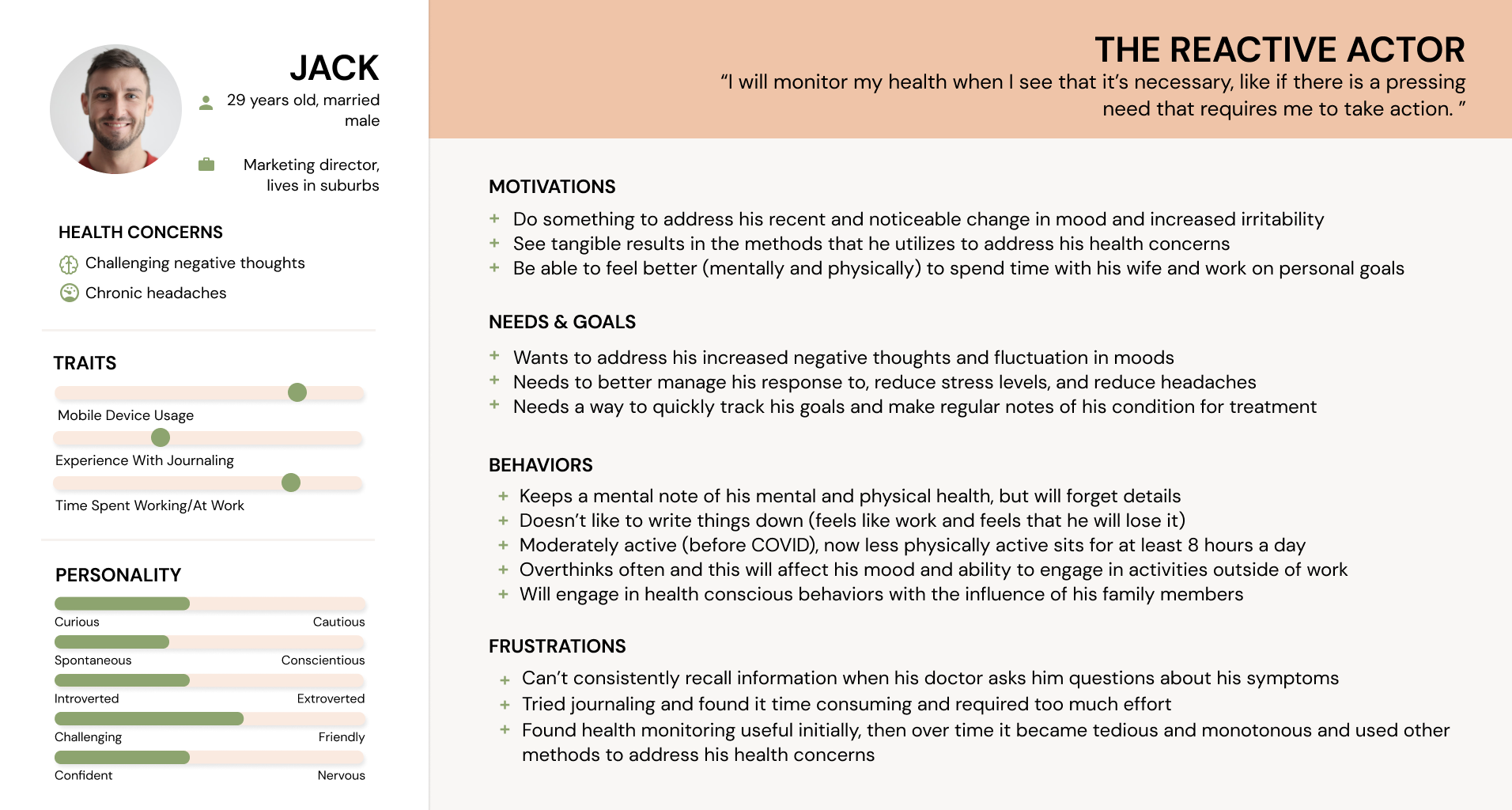
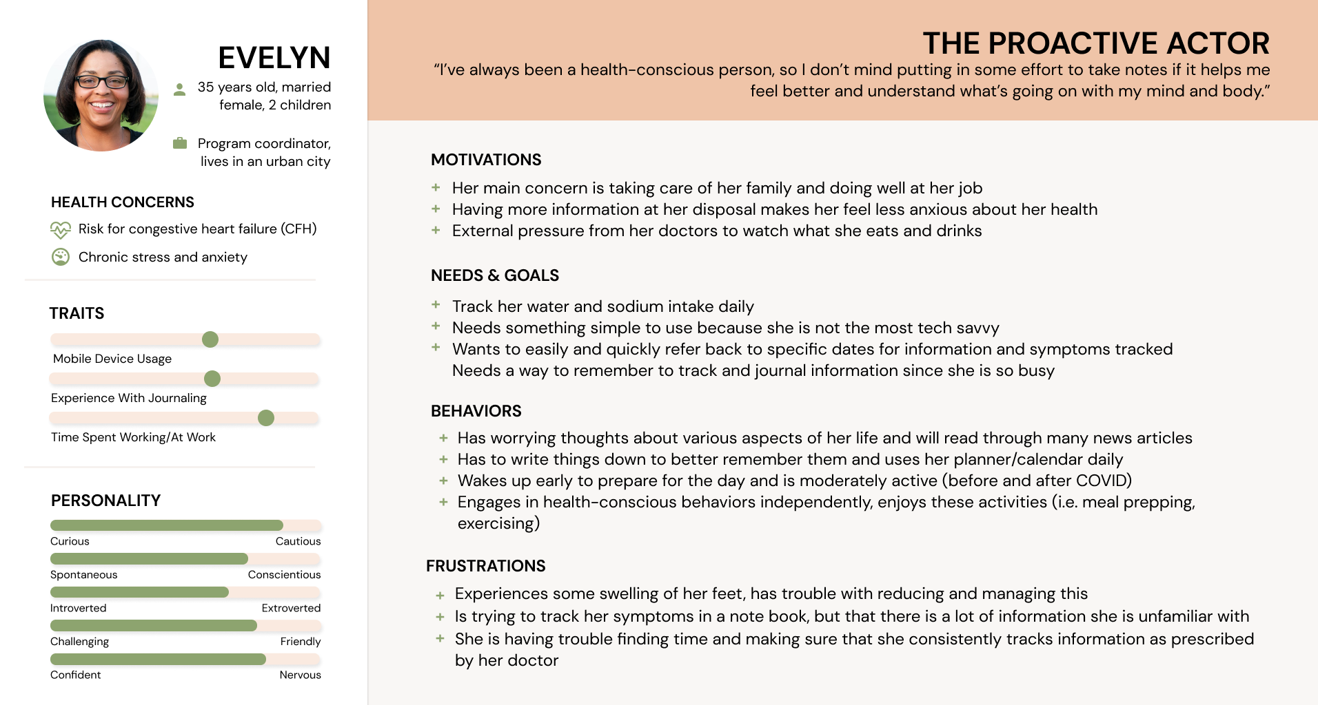
From my research data, two types of health monitoring users emerged.
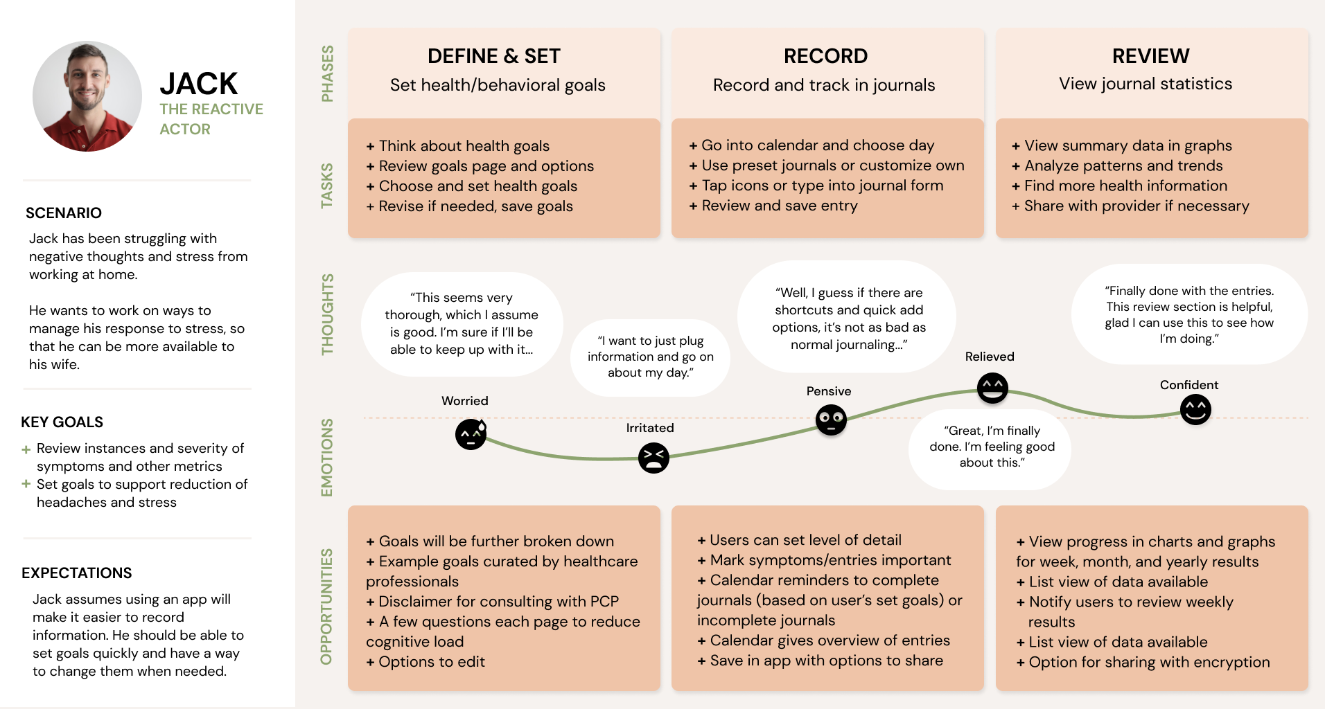
The Reactive Type
This persona engages in health monitoring behavior when something of immediate urgency is present.
The Proactive Type
This persona is usually health-conscious and monitors their health more often but consistency is impacted by external factors such as time.
Customer Journey Maps
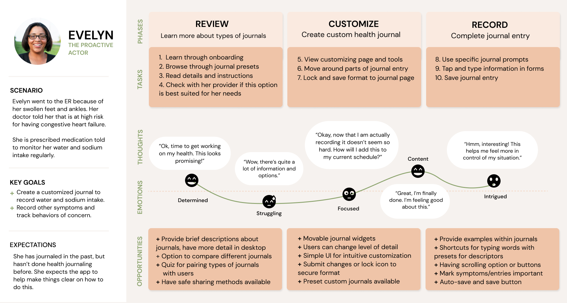
To design more holistically, I created customer journey maps for the two personas. With the information from the user interviews, I was able to outline their potential experience using Genko.
Ideate _____________________
User Flows
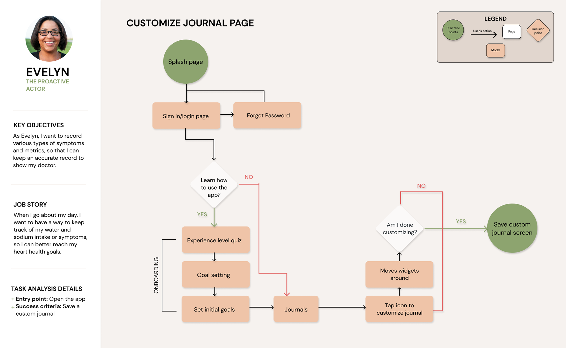
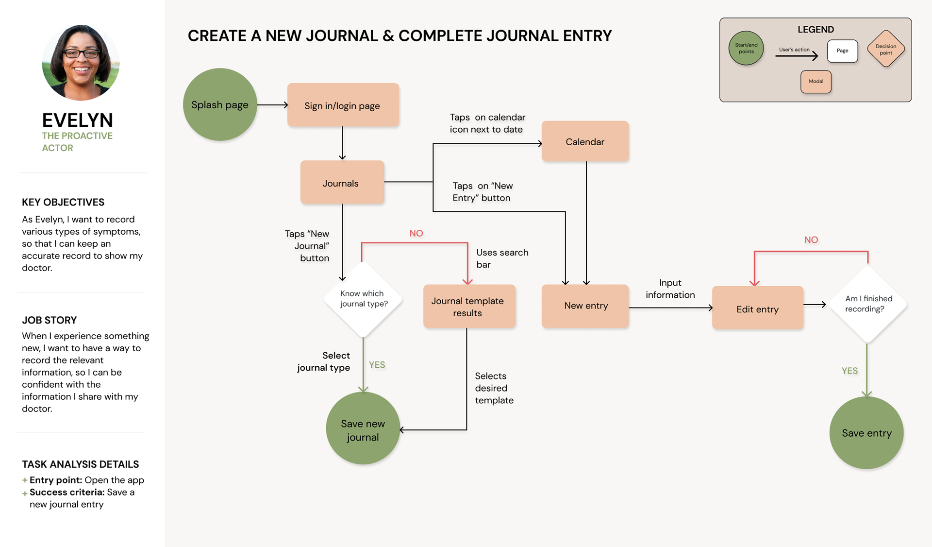
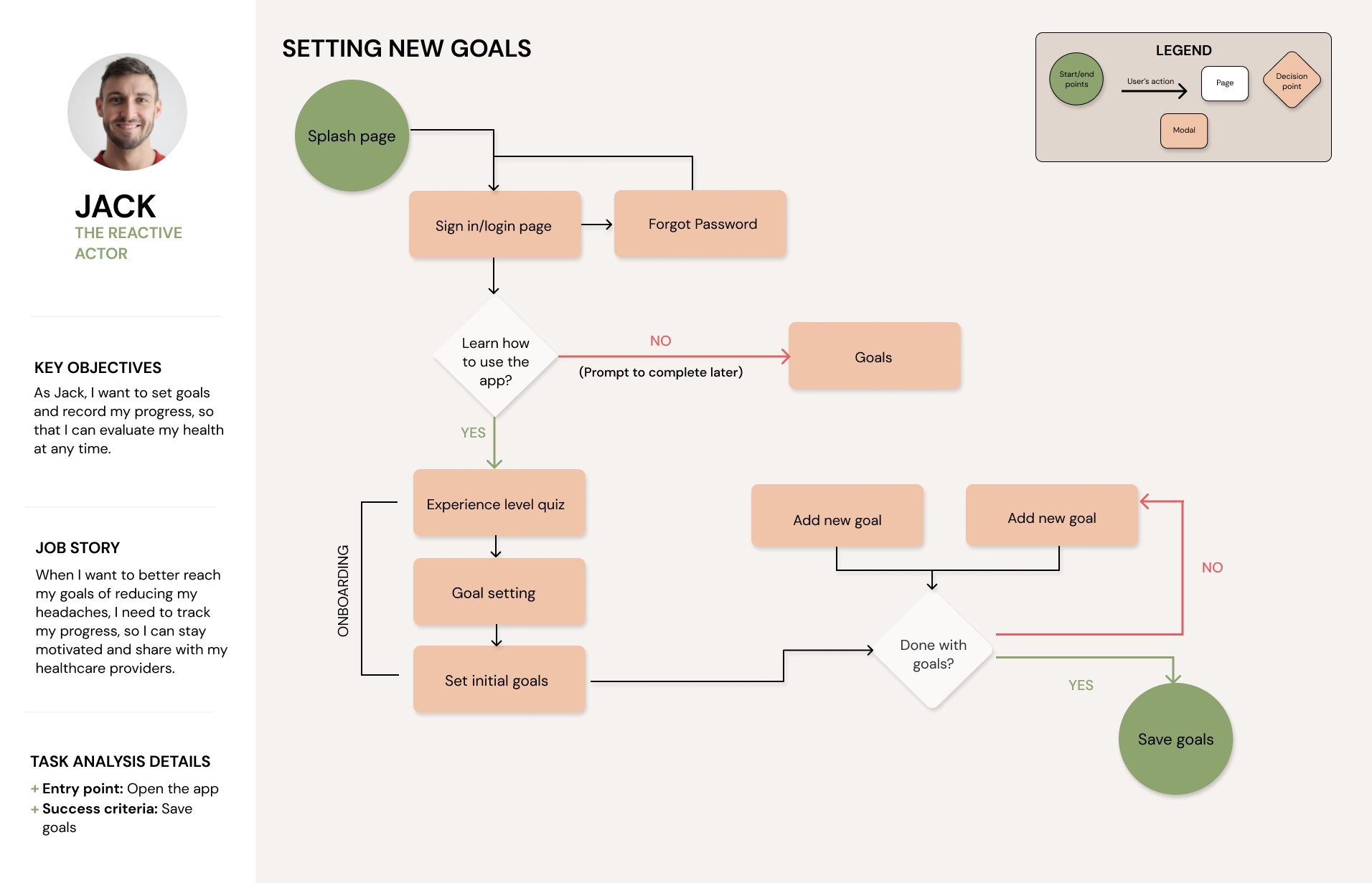
I used task analyses and user stories to create user flows of the personas’ actions with the features in Genko. It helped me define the features and the navigation of specific pages.
Main Tasks:
Although I created task flows for both personas, the app's features are primarily for Evelyn (The Proactive Actor)
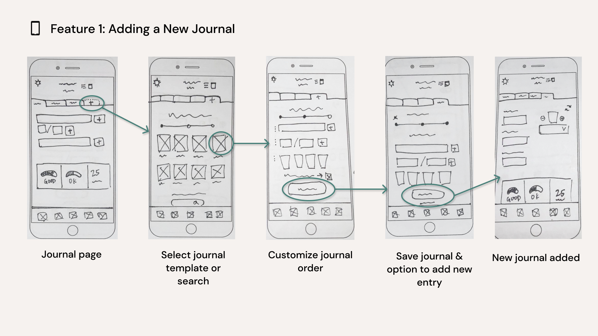
‣ Create a New Journal
‣ Complete Journal Entry
‣ Search for an entry using filter and/or tags
Task Flows
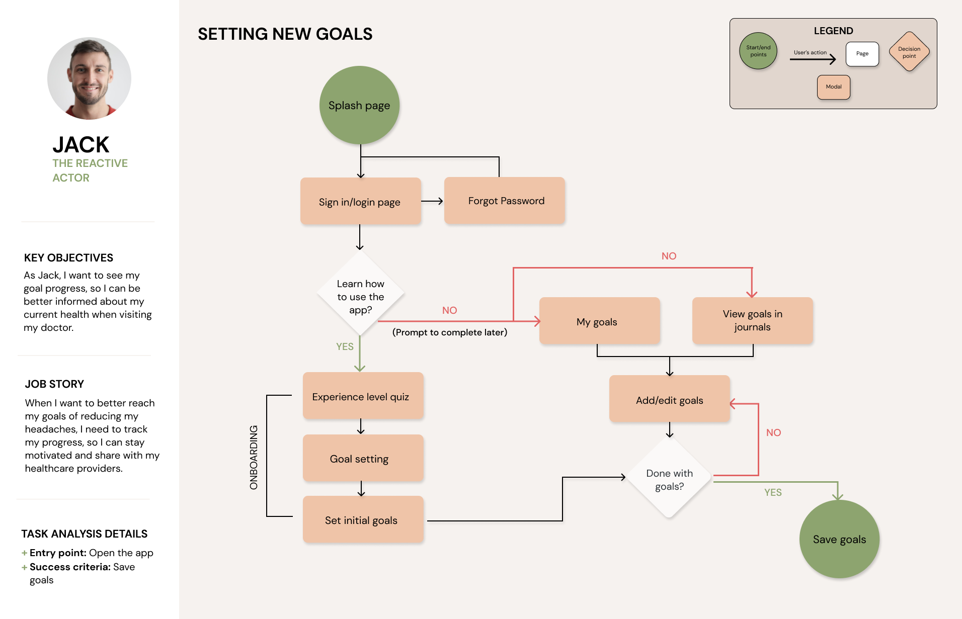
User Flow
Sitemap
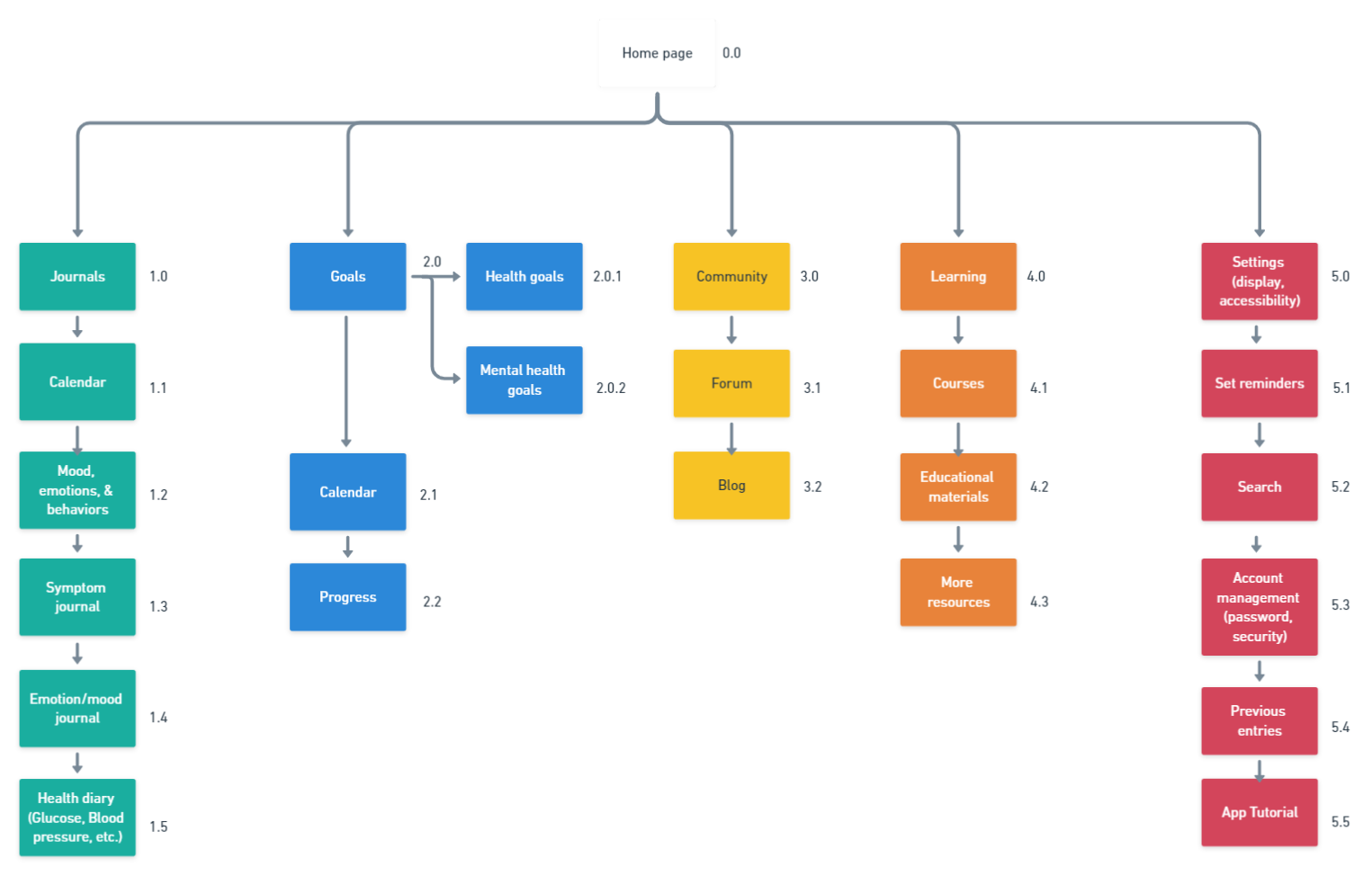
I created a sitemap based on the competitive analysis. I also hypothesized how the personas would best complete their tasks through the structure of the application.
Before:
I included 5 main pages in a simple indexed structure.
Card Sort
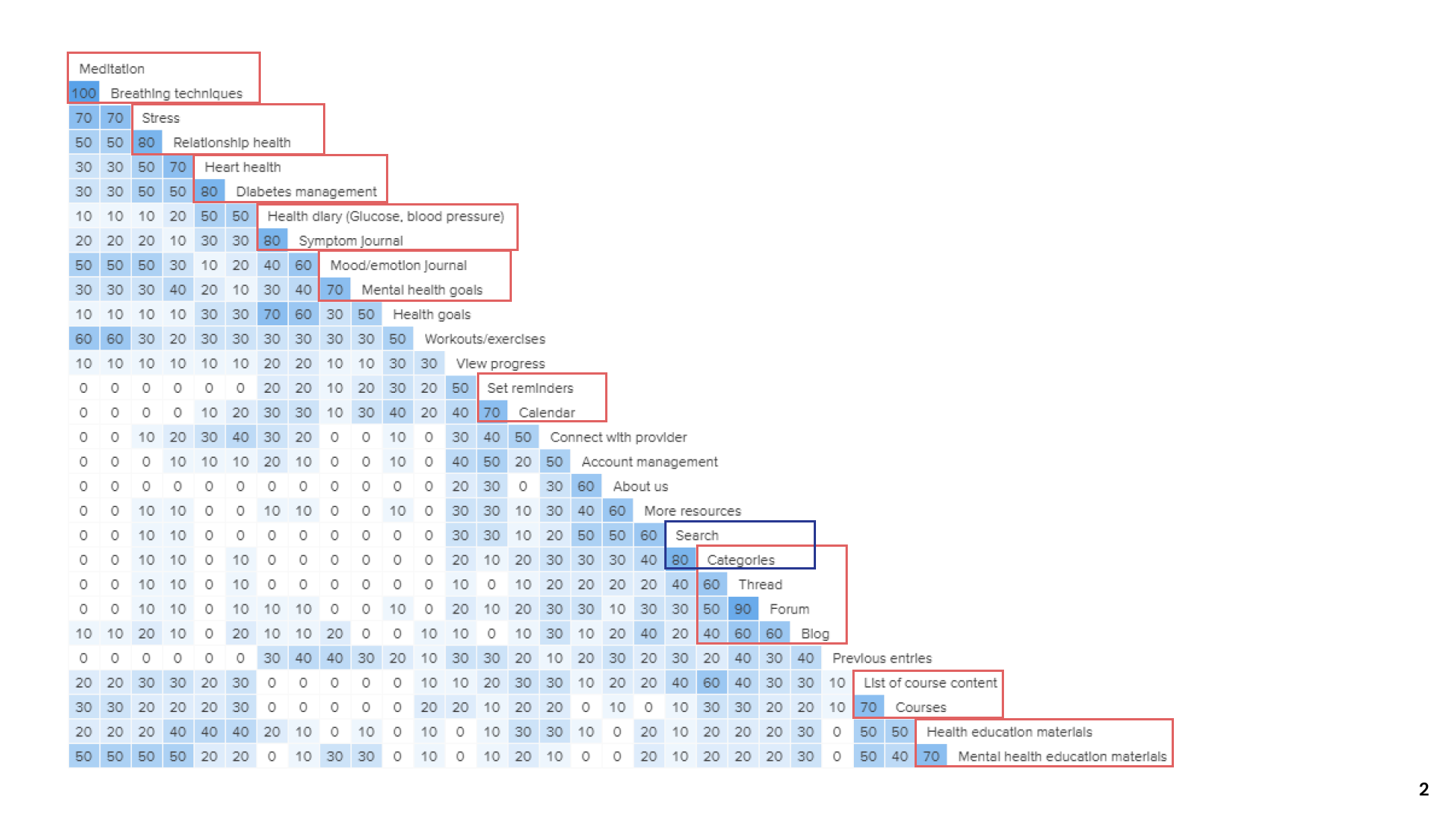
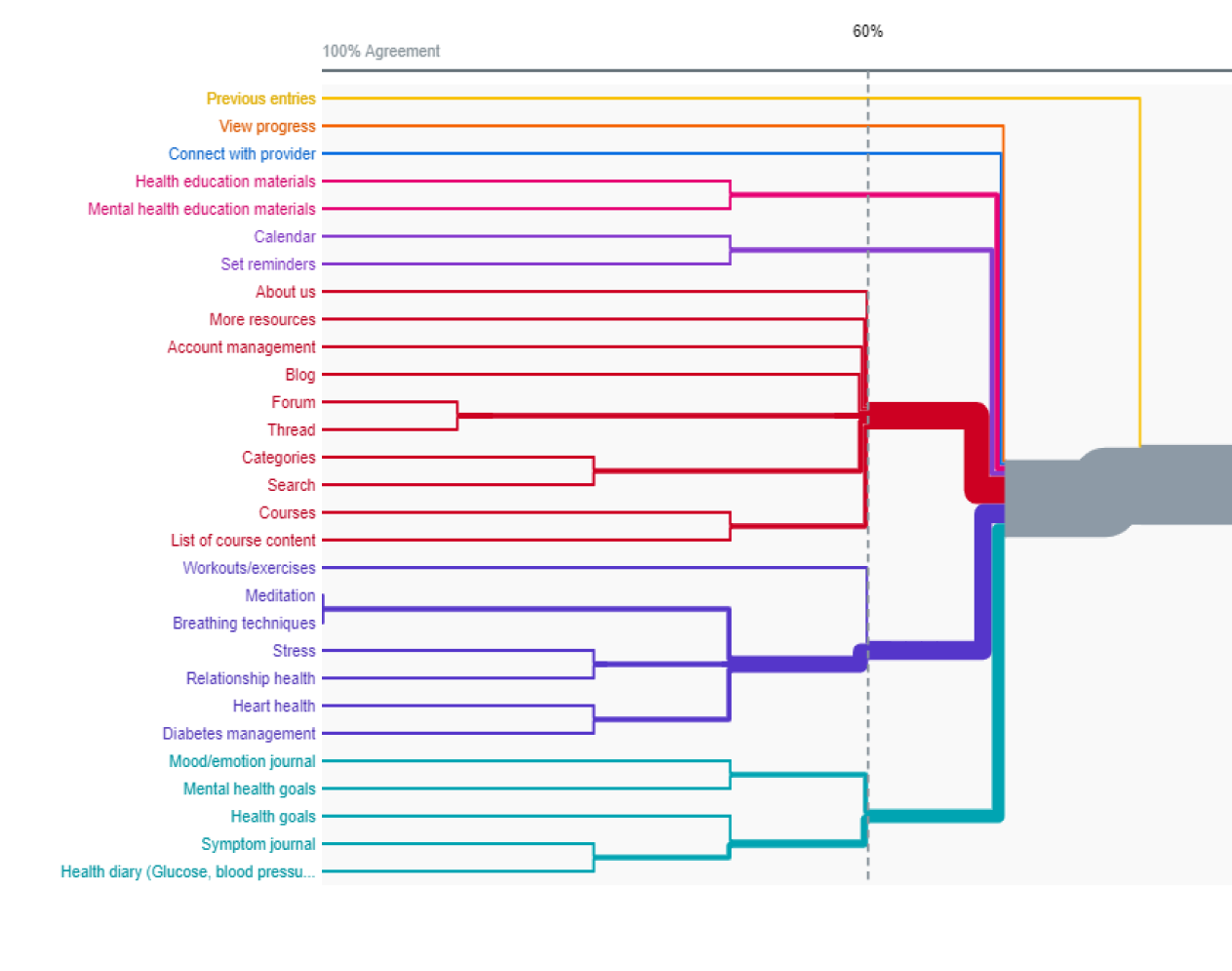
I conducted a moderated open card sort with a total of 5 participants. I decided on an open sort to see what groups would form from the cards provided.
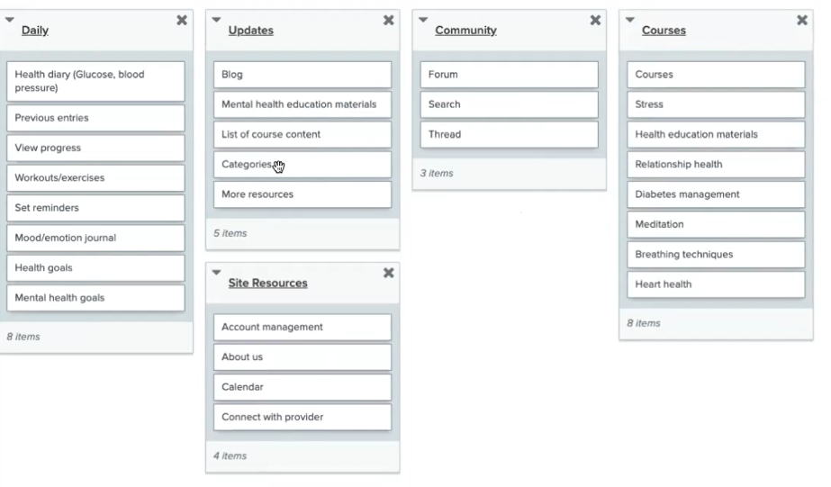
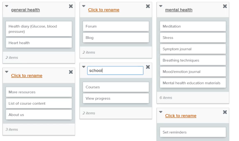
Key Insights:
‣ Only journals and the health score remained
‣ This removed confusion of how goals and journals worked
Changes:
I finalized the structure of the app as the combination of initial features did not make sense in the categories I previously created.
‣ Only journals and the health score remained
‣ This removed confusion of how goals and journals worked
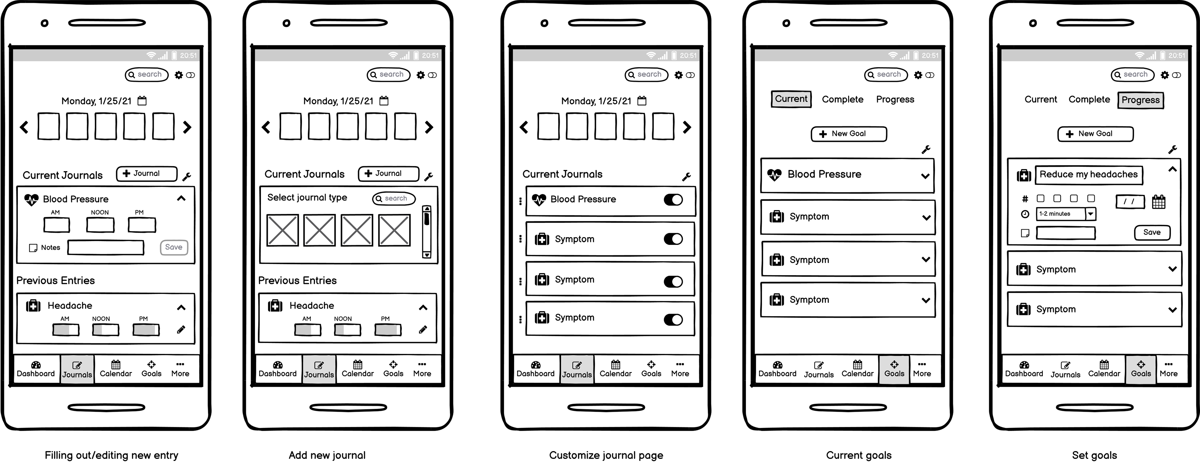
Low-Fidelity Wireframes
With the sitemap finished, I analyzed competitor screens via heuristic evaluation to understand the design patterns they used. Through this exercise and the insights I gathered, I designed my first version wireframes.
Prototype ___________________
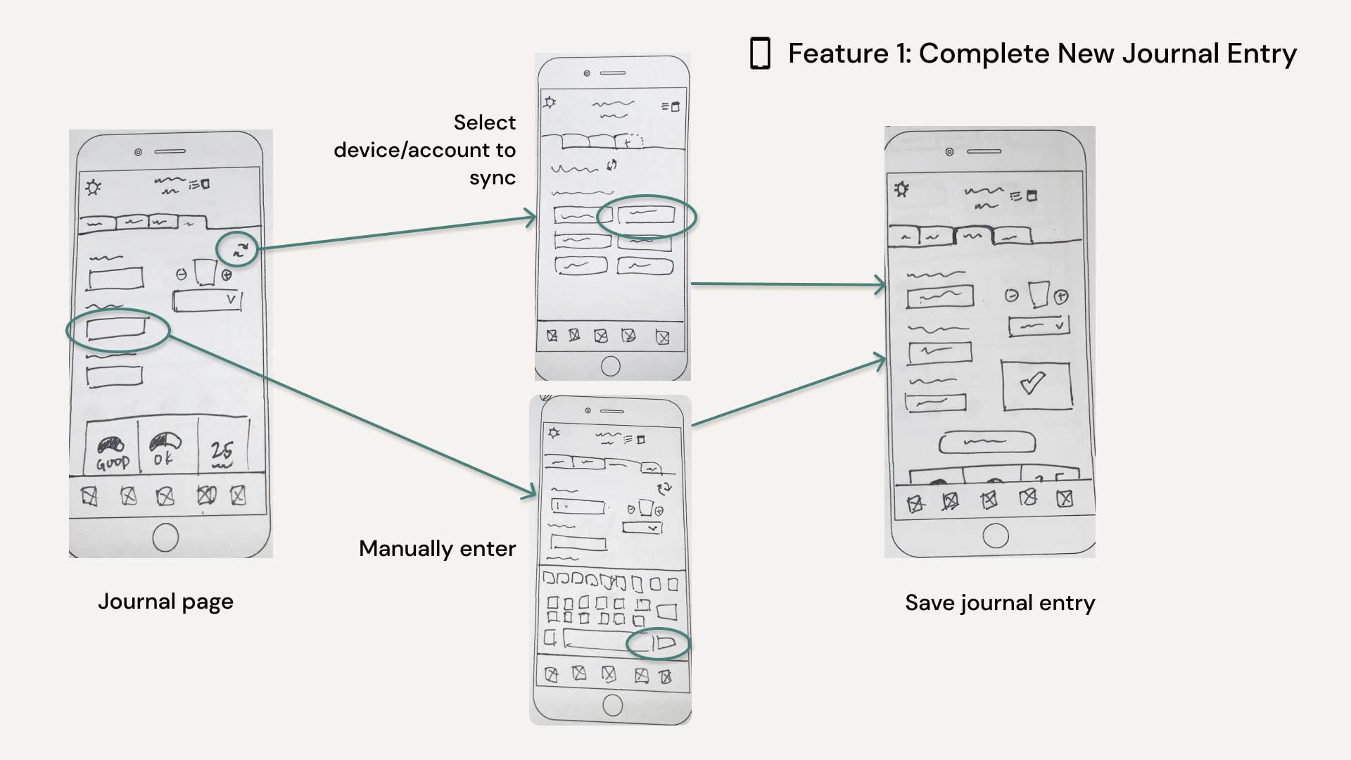
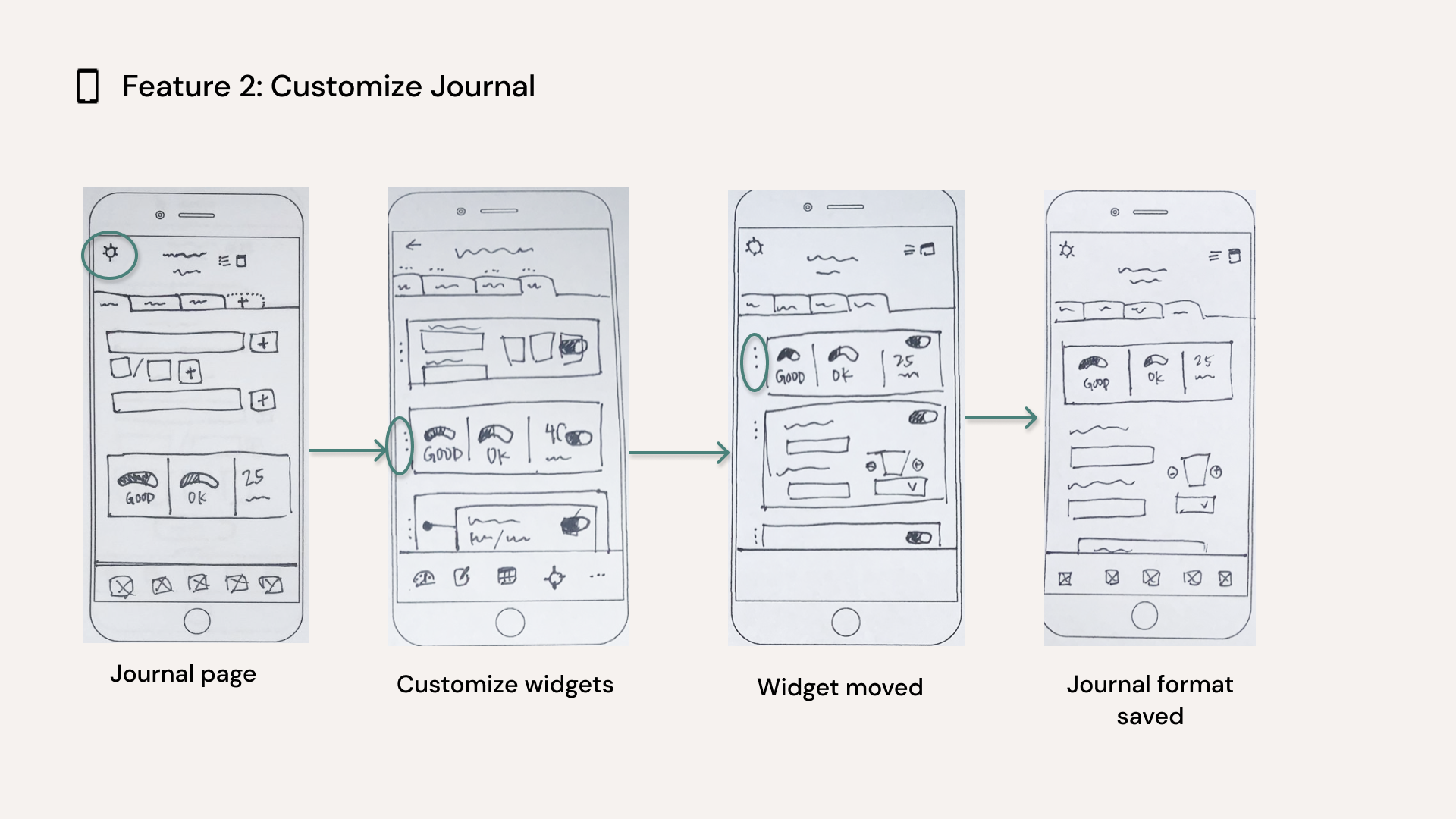
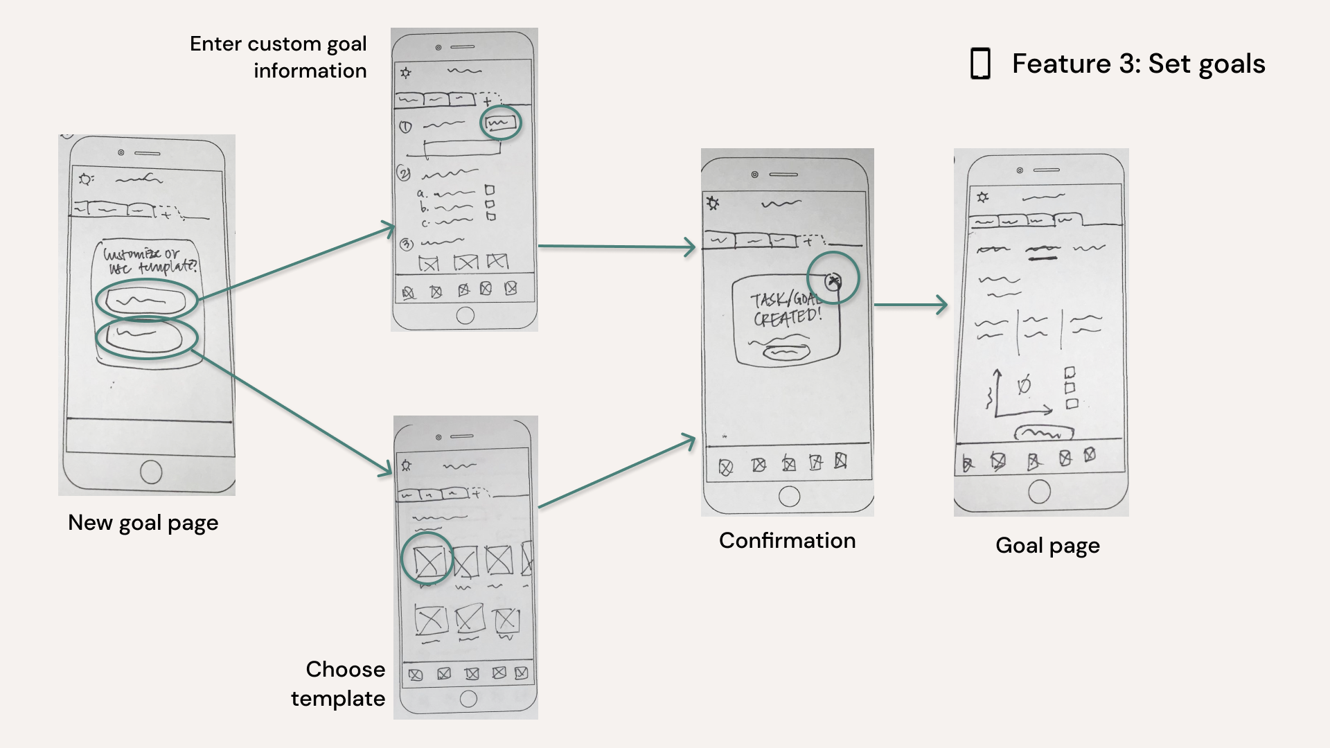
Paper Prototyping
Mid-Fidelity Prototype
Onboarding
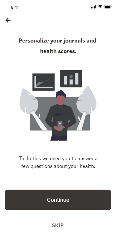
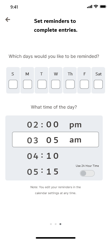
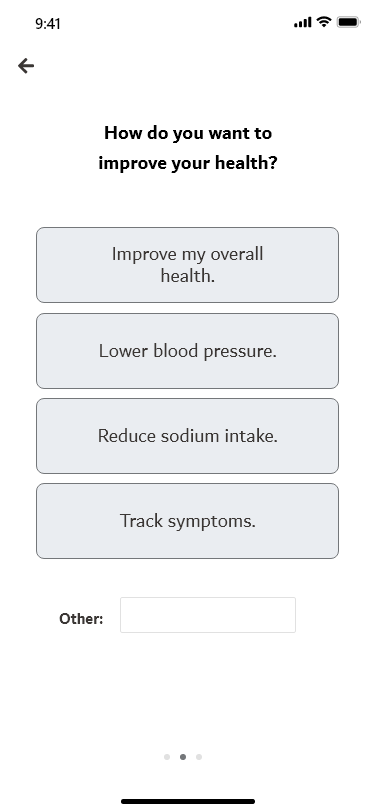
Journal Home
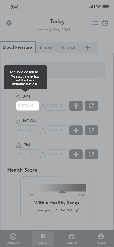
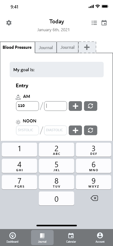
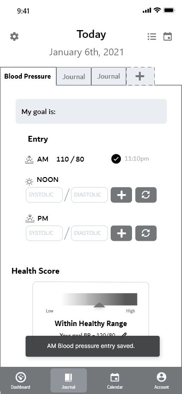
New Journal
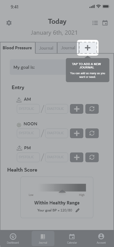
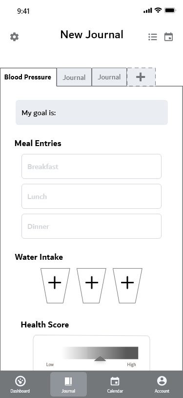
Test _______________________
Usability Testing
I conducted 6 moderated usability tests with people who never tested before. I kept the following goals in mind while writing the tasks and questions for the moderator guide.
Goals:
‣ Find any usability issues and errors users have
‣ Find out if the journal feature functions well and how people perceive its function
‣ Observe if users can complete an entry and create a new journal
Results:
Each area below represents 4 or more users, that highlighted a specific area of confusion or lack of usability
Unclear functionality/unusable:
‣ The flow and UI for completing a journal
‣ The function of the goal section on the journal page
Confusion with how features are integrated:
‣ The customizing option did not match people's mental models of what "customizing" in apps usually look like
‣ People didn't see how the goals would work together with the journal (not enough information in onboarding)
Want access to more information:
‣ Participants expressed the desire to access more information if needed
Iterate _____________________
Collaborative Feedback
Three other design peers reviewed my designs and provided me critique on what was confusing or could use improvements. I used this input to further iterate on the designs.
Onboarding
Journal Home
New Journal
Present _____________________
Final Designs
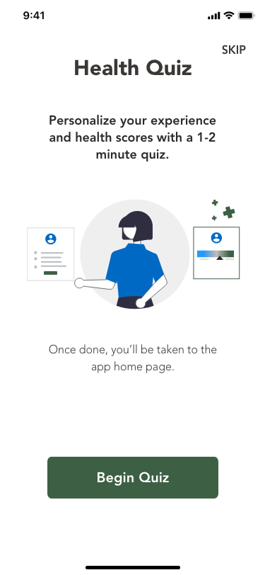
Onboarding Quiz
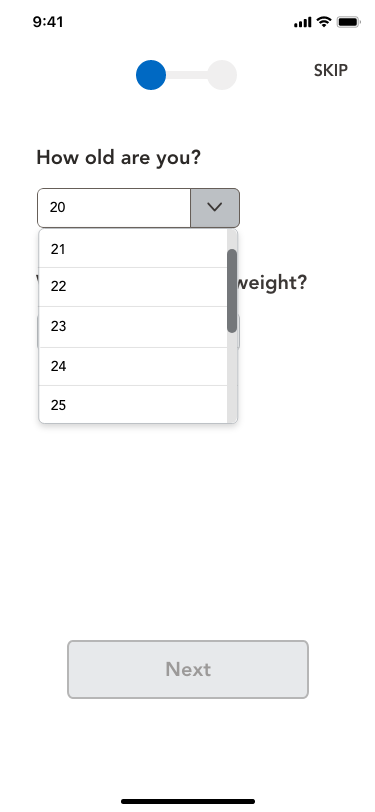
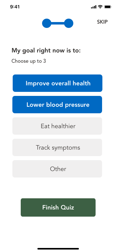
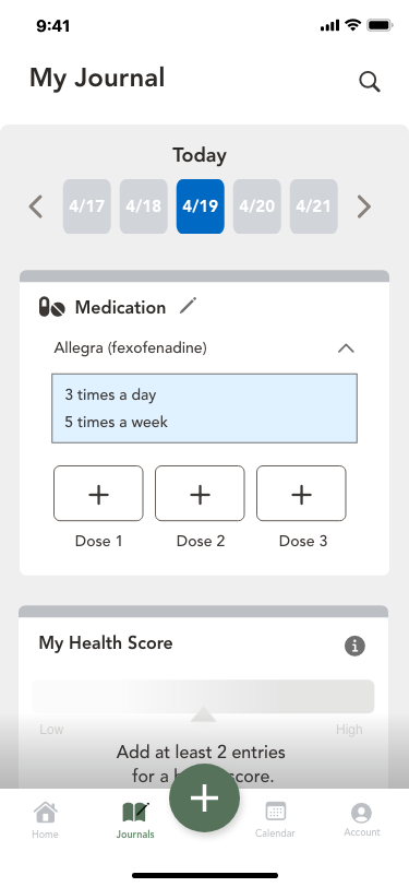
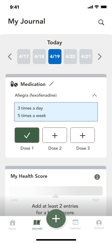
My Journal
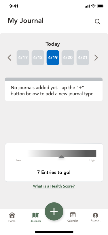
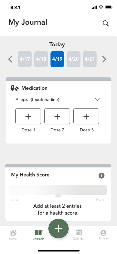
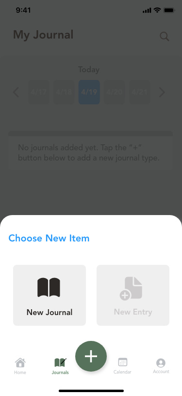
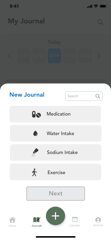
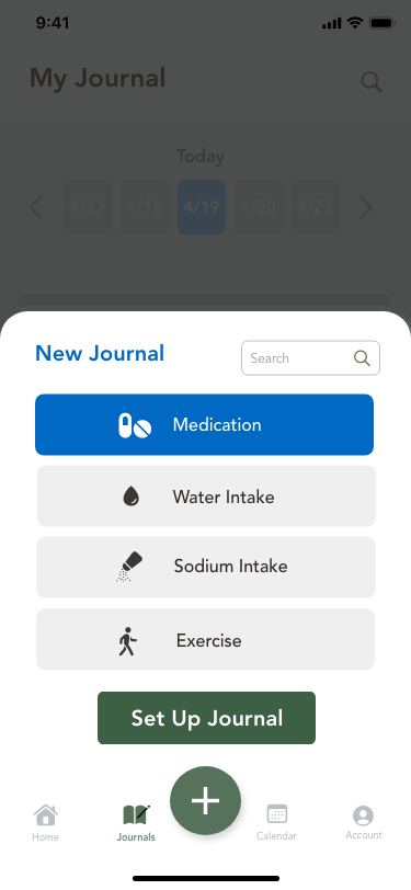
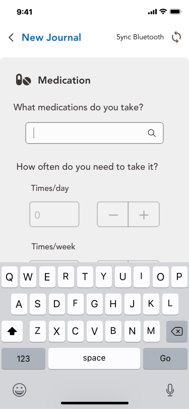
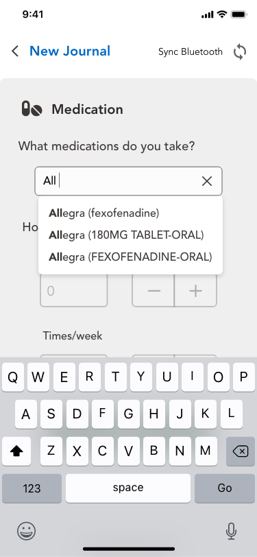
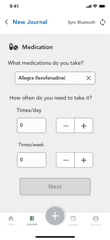
New Journal
Design Language System
I completed design documentation from the early stages using the Atomic Design Method by Brad Frost, which was suggested to me by my design peers.
The style guide was added when the design process continued to improve with each iteration.
The brand personality and visual design evolved from the analysis of data which revealed that users wanted something clean, simple, friendly, and something that felt reliable
Revised high-fidelity prototype
Using the information from the usability tests and critiques from fellow students and course tutor, I had improved my screens and overall flow as well.
Future Steps
If I had more time and could collaborate with another designer, I would prioritize the following to assess the value of the current design along with other things.
1. Conduct more research to:
‣ Improve the high fidelity prototype
‣ Validate the value of the features provided
‣ i.e. A cognitive walkthrough to examine:
‣ usefulness, findability, and accessibility
2. Develop a mental model
‣ Interview more diverse research participants
‣ Focusing on health tracking/monitoring app users
Questions to Answer:
‣ Are people able find the information they need to complete their main tasks?
‣ Do the interactions make sense?
‣ Are there any inefficiencies in the flow of screens?
